Top 12 Project Management Charts to Use for Better Results

What’s a project management chart?
A project management chart is any data visualization that allows project managers to better organize their work or convey their team’s progress and results to stakeholders.
There are numerous different charts that you might find useful at different points in your project. After all, some charts are better suited for project planning, others are great for keeping your team organized during the execution phase, and many are ideal for reporting.
In this blog, we’ll give you the rundown on a dozen of the most useful project management charts out there.
Why should you use project management charts?
Data is an important piece of all projects, but it is often difficult for project managers to gain the right insights from it. Fortunately, project management charts are great at presenting data in a digestible way, allowing project managers to easily identify and rectify bottlenecks and identify trends in progress.
Here’s a look at a couple of other benefits of adding charts to your project management processes.
1. Promotes transparency and team accountability
Fostering team accountability can be difficult. But when responsibilities are clearly assigned and progress is being closely monitored, you can help create a culture of accountability among your team.
Plus, many project management charts — such as Kanban boards, for example — give everyone on your team greater visibility into what everyone’s working on, promoting transparency. That way, you can keep your team’s workloads as evenly distributed as possible.
2. Helps with identifying inefficiencies
Are resources being used properly? Are we spending too much time on a particular phase? Will we be able to produce the deliverables by the deadline? These are all questions that project managers might ask themselves — all of which charts can help with.
For instance, burn-up and burn-down charts illustrate how well a team is spending its time and whether it will be able to be completed by the project deadline. By examining your data in these charts, you’ll be able to better assess what changes you need to make to your timeline.
3. Allows for better communication with stakeholders
Whether you’re working with an external client or internal stakeholders, you can be sure that they’re going to ask how the project is going while it’s underway. Instead of scrambling to verbally communicate an answer, you might be better off sending them a Gantt chart of your project plans or a flowchart of your team’s workflows.
After all, most people are visual learners, and helping stakeholders understand your team’s progress visually is an excellent way to ensure everyone is on the same page.
Related: What is Project Communication Management? An In-Depth Guide

Best project management charts for project planning
Without solid planning, your project will quickly begin to fall apart. Luckily, there are several charts that can help you better visualize what tasks need to be completed, how they align with your timeline, and what milestones you’ll need to hit along the way.
Gantt chart
Gantt charts are a type of popular project management chart that allows you to track your project schedule, tasks, and various project dependencies on a single chart. Gantt charts are similar to bar charts, with tasks on the vertical axis and time on the horizontal axis.
When you look at a Gantt chart, each bar represents a project task or activity, and the length of each bar represents the duration of that task. If your project has a lot of dependencies, visualizing your tasks in this way will help you better coordinate what needs to be done for everything to go smoothly.
Another advantage of Gantt charts is that project managers can color code them however they choose, whether that’s by phase, employee assignments, or priority level.
Pros
The biggest upside of Gantt charts is that they provide a comprehensive look at all of your project pieces in a relatively straightforward way. Because you can see everything at a glance — including your task dependencies — you can better anticipate risks to your project.
Cons
Gantt charts certainly aren’t the most simple type of project management chart out there. With so many moving pieces, they can be extremely time-consuming to create. Some complex projects might be too robust to use a Gantt chart altogether.

Milestone chart
Milestone charts are pared-back versions of Gantt charts. Whereas Gantt charts depict a ton of information about your project tasks and schedule, milestone charts only show your major project milestones.
The idea is that these types of charts can provide project managers with a decluttered look at what’s ahead for their team, allowing them to plan accordingly.

Pros
Sometimes too much information can be harmful. Since milestone charts only include major project turning points, they’re a great resource to share with stakeholders when trying to convey progress.
Cons
Milestones can be noted on Gantt charts too, so this chart type might be unnecessary for some teams. Another obvious drawback is that it lacks a lot of other important project information, so it’s most useful for project managers who are especially focused on setting achievable milestones.
Work Breakdown Structure (WBS)
When planning projects, many project managers elect to dissect their projects down into the smallest possible units to make tasks more approachable. A Work Breakdown Structure chart is designed to help you do just that.
A WBS diagram looks rather similar to an organizational chart depicting a company’s hierarchy. However, instead of listing upper management at the top of the chart, you’ll find the project objective, followed by the project phases on the next level, followed by project tasks for each phase on the level after that. Although this structure is most common, there is more than one way to set up a WBS, including a spreadsheet, tree, or list.
All in all, this type of project management chart might be worth looking into for teams where large tasks need to be broken down into smaller chunks and connected with larger project goals.
Pros
Work Breakdown Structures help project managers ensure their high-level understanding of the project work is solid. This way, when assigning tasks, they can be sure everything is accounted for. This type of chart is also great for helping identify bottlenecks before they occur.
Cons
A Work Breakdown Structure is only really optimal for a high-level understanding of project work. The typical WBS won’t depict the order of tasks, timelines, or dependencies, which are oftentimes very important pieces for the project manager to keep an eye on.
RACI matrix
The idea behind a RACI matrix is to assign team responsibilities for various project tasks. That way, everyone is on the same page regarding the level of involvement they’re expected to have for each action item.
RACI stands for Responsible, Accountable, Consulted, and Informed, and each team member is assigned an initial of R, A, C, or I with regard to each project item.
Team members who are marked as “Responsible” for a task are directly responsible for getting it done, whereas those who are “Accountable” are just in charge of delegating and reviewing the work for that task. Those in the “Consulted” category should provide feedback and input on the work at hand. And finally, people marked as “Informed” should just be kept updated on the progress of the work.
Pros
The RACI matrix is designed to eliminate confusion when it comes to task assignments. This is especially useful for cross-functional teams where people with a variety of skills are all working together toward a common goal. The best part is, you don’t need special software to create a RACI matrix.
Cons
If your project team is experienced in working together without the help of a RACI matrix, sometimes creating one can actually disrupt workflows and cause more harm than good. If your team’s workflows are already well-established, a RACI matrix may add unnecessary complexity.
Related: 50 Important Project Management Terms You Need to Know
Best project management charts for execution
Once your ducks are all in a row, it’s time to graduate from the planning phase to the execution phase. In the execution phase, it’s time to get down to business and complete the work you just spent all that time planning out.
However, projects very rarely go perfectly according to plan. There will inevitably be bumps in the road — which is why the charts you should employ for execution are more focused on streamlining work and solving problems. Let’s take a look.
Kanban board

Kanban boards are relatively simple task boards that are organized in columns according to the status of each activity. So an activity or task might begin on the left side of the board but move through each column as the team works on it, ultimately ending on the right side, for instance.
Different teams might use Kanban boards differently. Some might allow team members to choose what they work on next based on what items are furthest along, whereas others prefer this type of project management chart because it allows you to clearly see and understand what everyone’s working on.
That said, Kanban boards are best suited for more straightforward, heavily task-dependent projects. For example, marketing teams — particularly those in content marketing — often use this tool.
Pros
One of the key advantages of Kanban boards is that they allow you to easily visualize your team’s progress at a glance. They’re also very dynamic as you can quickly add and move new tasks as your project evolves, which is why this is a great chart for project execution rather than planning. They are also quite easy to set up — you don’t even need to use software tools.
Cons
Kanban boards are too basic for some teams, as they don’t account for timelines, dependencies, or resource allocation, and there isn’t a ton of flexibility. As such, it’s likely that you’ll need to create a new board when dealing with a new project phase or workflow. This can make it difficult to scale.
Fishbone diagram

Problem-solving is a skill required in all projects. Luckily, fishbone diagrams — sometimes called cause-and-effect charts — make it easier for your team to visualize potential causes of an effect or outcome your team’s dealing with.
To set up a fishbone diagram, you put the effect or problem you’re trying to solve onto the fish’s head, and then begin brainstorming and writing potential causes on the fish’s bones. Once you’re done, you’ll be left with numerous potential reasons why your team is experiencing an issue — a strategy that’s especially useful when experiencing bottlenecks.
Pros
Fishbone diagrams are super simple to put together and don’t require any software tools. Another benefit is that they help you identify multiple causes that might be at the root of your issue, which prevents you from jumping to conclusions or hastily taking action.
Cons
Complex projects usually come with complex issues, which may not fit neatly into a fishbone diagram. Additionally, not all potential causes are created equally, but this type of diagram doesn’t allow you to weigh the potential causes against each other.
It’s also worth noting that simply identifying the root cause of an issue is just the first step toward solving the problem. Fishbone diagrams are only useful if the project manager turns these ideas into an actionable response.
Flowcharts
Flowcharts make workflows clearer by illustrating the steps that need to be taken once particular decisions are made. Decision trees and user journey flowcharts are a couple of examples of flowcharts that you might be familiar with.
Flowcharts are a great resource for teams struggling with visualizing and documenting certain parts of their project process. With the help of a flowchart, it’s always clear what next steps should be taken.
Pros
Once again, this is a project management chart that you don’t need software to create. Another benefit is that flowcharts are pretty intuitive and easy to read, which makes them great for presentations to stakeholders.
Cons
Building a well-designed flowchart can be super time-consuming. Plus, complex projects can often lead to complex flowcharts, which are difficult to keep neat and readable.
Best project management charts for reporting
Reporting should be a continuous process at every project management stage. After all, proactive reporting is how you’ll identify issues — such as overspending — that need to be quickly rectified.
That said, even after a project is over, it’s important to compile reports and reflect on what did (and didn’t) go well. Your stakeholders will likely also have an interest in these kinds of insights. Utilizing charts is a great way to communicate this information in a clear and concise way.
Burn-up and burn-down charts
Burn-up and burn-down charts illustrate the work your team has left to finish as well as your remaining time, providing insights that will allow you to better distribute resources.
To create a burn-down chart, you need to plot your estimated task duration against the actual time on your chart. This will give you a better idea of how your expectations on how long tasks take shape up against how long they actually take in practice.
The burn-up chart tracks the quantity of work left to complete instead of the time it’ll take to complete it. To chart it, plot the ideal number of tasks remaining against the actual number of tasks. This way, if you’re significantly behind schedule with regard to the amount of work your team has left, then you know to reassess your resource allocation.
Pros
These charts are great for determining whether your project is moving at an appropriate speed. Both fit well within the workflows of scrum projects or agile sprints and can easily accommodate scope changes.
Cons
Like many of the charts on this list, burn-up and burn-down charts lack important context. For instance, maybe it seems like your tasks have been taking a long time to complete, but that’s really only because your team has been dealing with unexpected circumstances.
Burn-up charts also don’t indicate the type of tasks that your team has left. Perhaps your team still has a long list of action items but they are all much easier to complete than the tasks that are already marked done.
Pie chart

You’re likely already familiar with pie charts, as they’re an extremely versatile and simple way to relay information to an audience. The entire “pie” adds up to 100%, and each segment of the pie represents a percentage that’s been allocated to different variables.
From a project management perspective, a pie chart might be used to depict what the budget was spent on, for instance. Overall, this type of chart is best for straightforward data that doesn’t require much additional explanation.
Pros
Pie charts are incredibly simple to make since you’re able to turn numbers into a pie chart using a basic spreadsheet tool. They’re also extremely intuitive, which makes them a good fit to include in reports where you might not have the opportunity to provide additional context.
Cons
The simplicity of pie charts is often a double-edged sword. Oftentimes, you’ll need to include a key alongside your pie chart, and if you’re trying to convey too many data points, then you’ll need to use several pie charts to get your message across.
Pareto chart
A Pareto chart is a combination of a line graph and a bar chart. The horizontal axis will list the variables you’re monitoring, and the vertical axis will be the unit of measurement.
The bars should always be arranged with the highest variable on the left and descend from there with the lowest variable on the right. The idea is that representing this data in two ways makes it easier to identify the impactfulness of different variables on a particular problem.
For example, if your team missed a critical deadline, you could make a Pareto chart with each person’s reported reason for being unable to complete their work on time. The response that’s most commonly reported will appear on the far left, meaning you may want to tackle that issue first to avoid missing future deadlines.
Pros
Pareto charts are great for prioritization. If your team has spent time creating a fishbone diagram, you may put that information into a Pareto chart to determine what to tackle first.
Cons
Because Pareto charts are commonly used for solving problems, it’s worth noting that this chart only denotes the number of variables instead of the severity. This makes it difficult to determine cause and effect relationships from this chart alone — you’ll likely need to use another chart type to do so.
Control chart

All projects deal with change — oftentimes in the form of scope creep. Compiling a control chart as part of your reporting process will help you understand how your project has fluctuated over time.
In simple terms, a control chart is basically a line graph that has an upper and lower control limit. Your upper limit typically signifies numbers that mark when your performance has exceeded expectations, with the opposite being true for your lower limit.
Control charts are typically used to measure the outputs of a process, that way you can easily identify when the process isn’t going as planned by simply looking at your chart.
Pros
Because each data point will be recorded on your control chart, this is a great way to identify outliers and identify what caused those outliers to occur. Control charts are a performance management method that tends to work best when implementing a new process that’s ripe for trial and error.
Cons
When you look at a control chart without any additional context, it can be super difficult to decipher them. This probably isn’t the type of chart you’d want to include in a stakeholder presentation, for instance.
Another potential downside is that the quality of your control chart depends on the upper and lower limits you’ve chosen. Choosing limits that aren’t actually indicative of the success or failure of a process can make the chart useless.
Bar chart
Bar charts are certainly one of the most basic project management charts on this list — you might’ve even learned how to make them in elementary school.
Bar charts most commonly compare the quantity of different variables by plotting them against numbers on the X and Y axes. That said, bar charts have several variations, including the vertical bar graph, which functions more like a pie chart.
Pros
Because almost everyone has some level of familiarity with bar charts, they’re great for use in presentations. Their intuitive nature is a key advantage.
Cons
As we discussed with the pie chart, simple charts can be difficult to use in situations involving complex data. It’s very difficult to use a bar chart to represent data that comes with a lot of nuance.
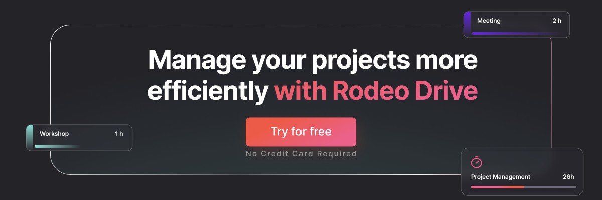
Better organize your projects with Rodeo Drive
If you’re wondering how to collect the data that you’ll need to create project management charts, the answer is an all-in-one project management tool, such as Rodeo Drive.
Rodeo Drive is a project management solution that provides all of the features creative teams need to manage their projects all in one place. We know switching between apps can be a huge time waster, so our goal is to streamline your workflows.
Rodeo Drive offers the following features:
- Phase-based budgeting: All projects begin with a budget in Rodeo Drive so that you’re set up for project profitability right from the start.
- Time tracking: Record your time live as you begin working on a task or enter a timecard later on if you forget. This way, you can be sure you’re billing clients for the correct amount.
- Task planning: Map out who’s working on what and when.
- Invoicing: Bill clients directly from the Rodeo Drive platform in the UK and via QuickBooks in the US.
- Reporting: Automatically generates reports on in-progress projects, closed projects, time registration, and employee productivity.

Another added benefit of a tool like Rodeo Drive is that you’ll always have access to data on your team’s usage of the platform, which you can export and compile into the project management chart of your choosing.
It’s simple! Try Rodeo Drive for free today.