What's a PERT Chart? How to Create One in 5 Easy Steps
Planning projects can be messy. But PERT charts can help clarify your project timelines and make your task dependencies understandable.
In this blog, we’ll breakdown the pros and cons of organizing projects with PERT charts, before helping you create one in five simple steps.
What’s a PERT chart?
PERT stands for Program Evaluation Review Technique. A PERT chart is a network diagram that represents your project timeline, task durations, and dependencies with a project’s critical path in mind.
PERT charts are used to help project managers map out their project work to ensure their expected timelines and resource allocations are correct. They’re also useful for identifying bottlenecks and other risks that may delay the project’s delivery.
How does a PERT chart work?
Visually, a PERT chart should look like a network diagram. Each node represents a task and its essential information — like the expected duration — with arrows connecting the nodes to represent dependencies. The arrows are used to denote the sequence of tasks.
The critical path should also be highlighted within the PERT chart to denote the tasks that are most imperative to the project’s completion.
.png)
When should PERT charts be used?
In general, PERT charts are useful for projects where the timeline, resource allocations, and critical path require additional clarity.
This is because once you’ve laid out all of your tasks, a PERT chart allows you to identify interconnections that you may have not realized, which can allow you to better allocate resources.
Here are some additional criteria that might make your projects a good fit for a PERT chart:
- Large-scale projects with a lot of activities: Projects involving sequential or parallel activities will likely involve dependencies, which a PERT chart can help you easily visualize.
- High-complexity projects: Projects with intricate workflows can be difficult to manage. A PERT chart can aid in the planning and coordination of those complexities, making them easier to visualize.
- Risk management: PERT charts help identify potential bottlenecks, which can be incredibly helpful in ensuring your risk register has the right information. This helps your team anticipate and overcome obstacles smoothly.
Related: Keep Your Projects on Track With This Risk Register Template
PERT chart vs. Gantt chart
PERT charts and Gantt charts are commonly used to better understand project timelines. For this reason, both charts are used in similar situations, but they do still have some key differences.
When it comes to their similarities, PERT charts and Gantt charts both outline the key tasks that must be completed for project success, help you determine the resources needed for each, and allow you to monitor a project’s progress.

However, there are also some key differences:
- Visualization style: Gantt and PERT charts look different from one another, as Gantt charts adopt a bar graph style, whereas PERT charts are flowcharts.
- Dependencies: Gantt charts do not illustrate dependencies, which means Gantt charts aren’t well suited for monitoring the impact of missed deadlines.
- Clarity on critical path: PERT charts identify your critical path, which is the longest sequence of dependent tasks required to complete the project. This helps determine the project’s minimum duration, which helps with prioritization. Although Gantt charts can also show critical paths, they don’t provide the same level of detail as a PERT chart.
- Flexibility: Gantt charts grant project managers more flexibility in adjusting task durations and resource allocations, which makes them more suitable for tracking project progress. PERT charts are more focused on reducing uncertainty by charting dependencies rather than emphasizing detailed scheduling.
- Use cases: PERT charts are most relevant for projects facing high uncertainty, complexity, and interdependencies. On the other hand, Gantt charts are a project planning tool that’s widely used in projects with well-defined tasks and timelines in industries like construction or software development.
PERT chart pros and cons
Building a PERT chart can be a very resource-intensive process. While there’s no doubt that most projects would benefit from seeing their task dependencies mapped out visually, sometimes the benefits of a PERT chart don’t outweigh the cost of the time and planning you’ll need to put into it.
Let’s take a closer look at some of the pros and cons to help you decide whether it’s worth your while.
Pros
PERT charts are great at helping you answer those “what if” questions that arise during your planning process. For example, “What if our materials aren’t delivered? What if a project team member suddenly leaves?”
A PERT chart helps you to see how these events would impact dependent tasks throughout the project. This is especially useful when building a contingency plan, as you’ll be equipped with the right information to create a realistic plan B.
Here are a few of the main advantages of using a PERT chart:
- Clear representation of your tasks and dependencies: By providing a way to visualize the various activities your project requires, PERT charts can help project managers better understand their project’s structure and complexity.
- Effective scheduling and resource allocation: By allowing project managers to piece together their task durations and identify their critical path activities, PERT charts help project managers get a better understanding of how they’ll need to allocate resources to complete projects on time.
- Proactive risk management: PERT charts highlight potential areas where the project may veer off course, or where it may encounter bottlenecks. This allows for proactive risk planning to prevent these issues from arising.
- Helps with team communication: Visual representations of your project plans help give everyone on your project team a baseline understanding of your expected project progress and how each activity impacts other pieces of the project.
Cons
Before you fully commit to creating a PERT chart, you’ll want to be fully aware of some of the drawbacks. Here are some of the disadvantages of a PERT chart:
- Time consuming: Creating a PERT chart involves a high degree of detail on each project activity, including an accurate estimate of how long it will take. Not only does this require a lot of the project manager’s time, but it often requires stakeholder cooperation to ensure accuracy.
- May oversimplify your projects: There’s a limit to the amount of detail you’re able to include on a PERT chart, which may cause an accidental oversimplification of complex projects. If you’re not careful, this can lead you to disregard nuances in your dependencies or cause other oversights.
- Doesn’t account for uncertainties: Initial estimates may quickly evolve once the project is underway, which may render your PERT chart less relevant, as it’s unable to account for those uncertainties.
5 simple steps to create a clear and helpful PERT chart
So, you’ve evaluated the advantages and disadvantages of PERT charts and have decided it's a worthwhile investment of your time and effort. The next step is to actually create one.
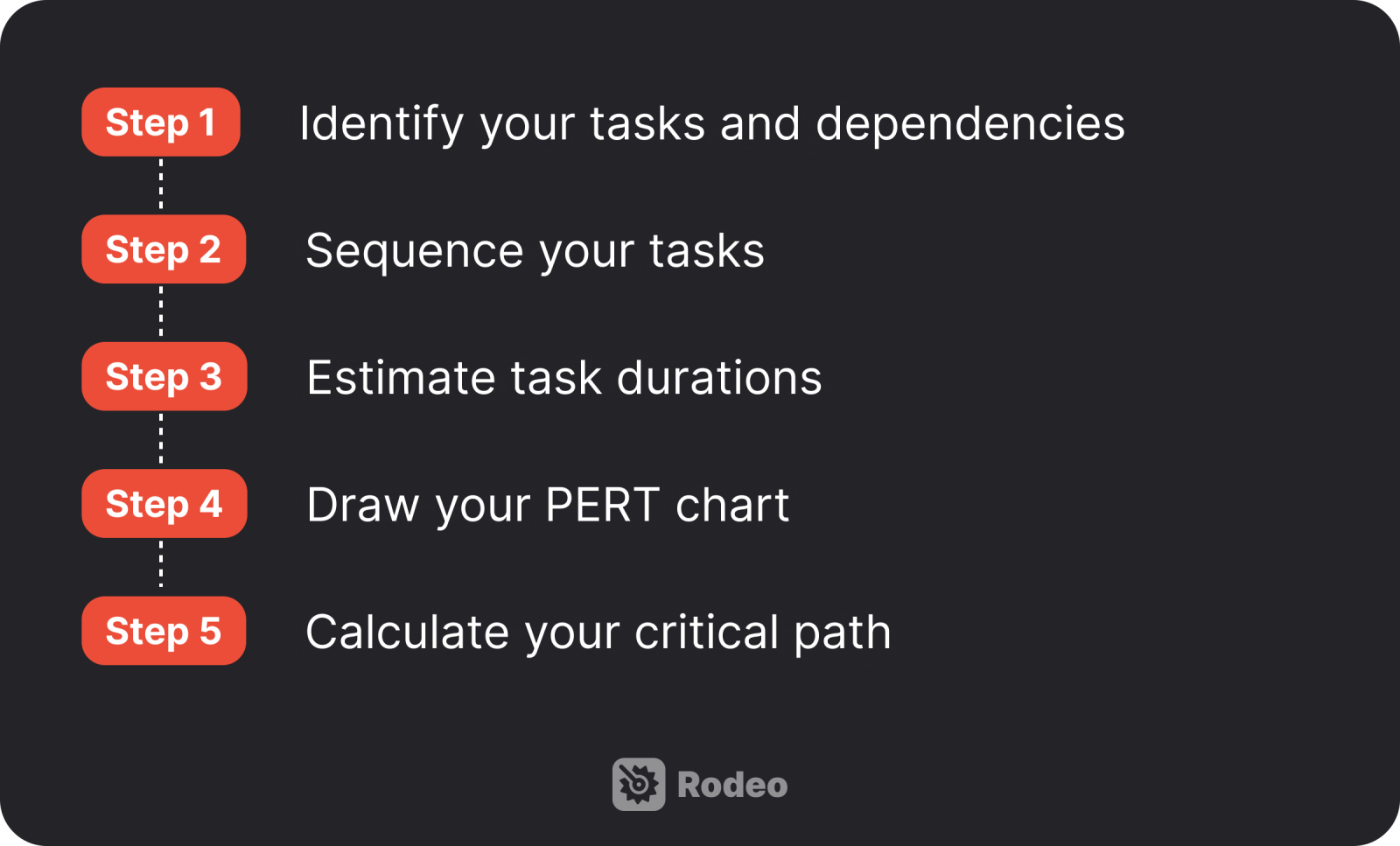
Here are the five steps we suggest you should follow to create a PERT chart that’s beneficial for your team.

1. Identify your tasks and dependencies
Tasks are at the core of your PERT chart, so it only makes sense to start this process by identifying all tasks the project team needs to complete to consider the project a success.
One way to do so is by working backward from your objectives, goals, and project milestones. For instance, when you have milestones that mark your team’s progress, consider which tasks or other activities need to be completed to hit those benchmarks.
2. Sequence your tasks
In this step, you’ll need to determine the order in which your tasks should be completed. This is where you’ll need to identify task dependencies to schedule your project activities as efficiently as possible.
The term “task dependencies” refers to the sequential relationships between tasks, where the start or completion of one task directly impacts the beginning or end of another. A useful PERT chart is based on a clear order of dependencies, why it’s important to invest time into the clear identification of your tasks.
For example, if one of your tasks is to develop creative assets for your marketing campaign, your team can’t start on that task until the market research has been completed and your team has decided what those creative assets should look like. It wouldn’t make sense for you to schedule the creative assets to be developed at the very beginning of the project since that’s a dependent task.
3. Estimate task durations
After your tasks and dependencies have been identified and sequenced, you’ll need to estimate the time you expect it will take to complete each. This can be a tricky task, but it’s important to get it right to ensure accurate scheduling and resource allocation.
Estimating task durations can be especially difficult if you’ve never worked on a similar project before and don’t necessarily know how long each task will take. Be sure to consider the resources at your team’s disposal, the complexity of the task, and potential risks the team might face when estimating.
Many project managers assign three time estimates to each task: optimistic, most likely, and pessimistic. Using a range can help combat uncertain estimates that are difficult to stick to.

4. Draw your PERT chart
Once your information is all set, it’s time to bring the PERT chart to life. Start by representing each task as a node or a circle within the chart. For each task with a dependency, include an arrow to denote the relationship between them. Each task should have its name and estimated duration clearly labeled on the chart.
Some teams might find it useful to add their milestones or key deliverables to the chart, so that significant milestones are appropriately flagged, to make for easier project planning.
5. Calculate your critical path
After your PERT chart has been put together, you can finally calculate your critical path. As we’ve already mentioned, this is the longest sequence of dependent tasks that determines the minimum duration of your project.
So, for example, if you put all of your project tasks together and it looks like your critical tasks will take 6 weeks to complete in the most likely scenario, 8 weeks in the pessimistic scenario, and 5 weeks in the optimistic scenario, you can manage client expectations accordingly.
Manage your project activities more efficiently with Rodeo Drive
Extensive project planning can certainly be useful, but sometimes your projects don’t always materialize in the way you planned.
But with the help of a project management tool, you can closely monitor your project’s performance to ensure your PERT chart is unfolding as planned.
Rodeo Drive is one example of a tool that can support your projects at every stage of its life cycle. With budgeting, time tracking, planning, and reporting all in one place, you’ll have everything you need to see your projects through to success.
Here’s an overview of some of Rodeo Drive’s popular features:
Assign project activities and keep team capacity balanced
Building a PERT chart is one thing, but assigning the work to your project team to execute is a whole different balancing act. On one hand, you need the work to get done, but on the other, burnout can hurt your team.
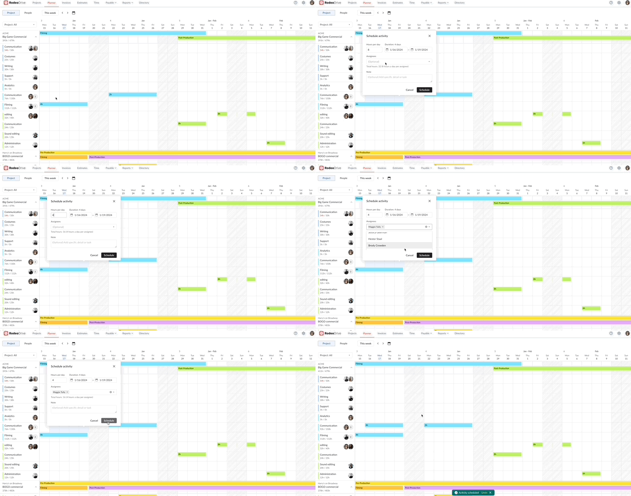
Fortunately, Rodeo Drive offers a comprehensive timeline-view planner that you can use to assign activities to your team and schedule them based on each person’s capacity.

Assign activities to team members, including a description of the task
The planner also keeps track of the number of hours you estimate for each activity, so if you schedule an activity for more hours than you’ve budgeted for, it will be noted in red on the planner.
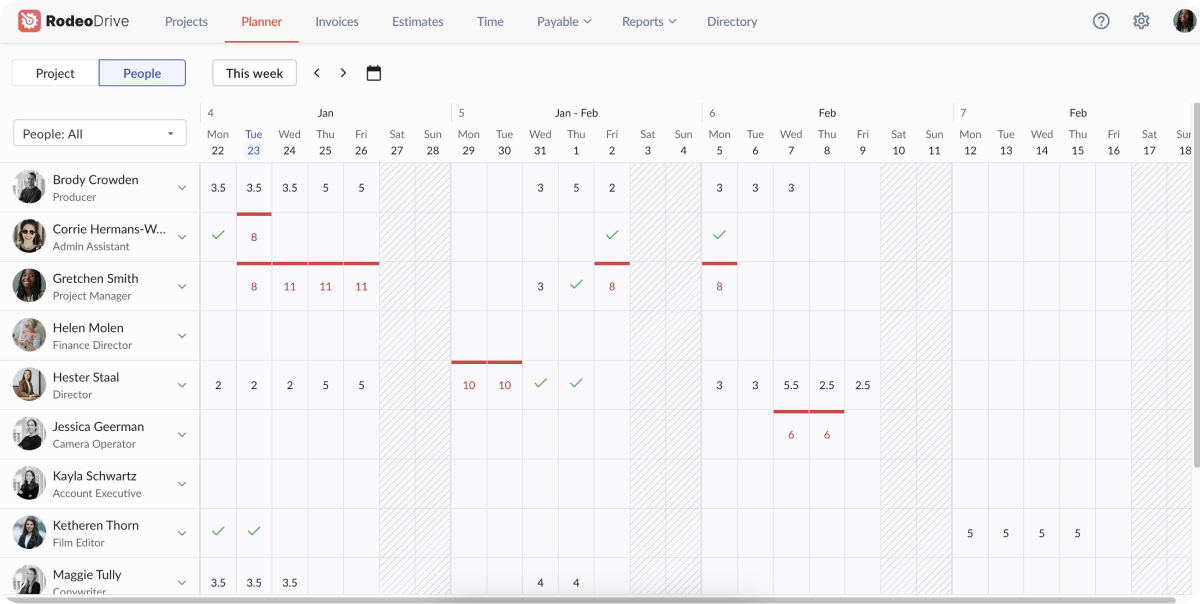
Rodeo Drive’s people-view planner provides an overview of the number of hours each team member is scheduled to work on project tasks every day. If their hours are fully allocated, you’ll see a green check. If they’re over allocated, their hours will show in red. This helps prevent burnout and ensures work is properly distributed across the team.

Your people-view planner shows how many hours each team member is scheduled for on a daily basis
Time tracking for an accurate look at your task duration
Estimating the duration of your project tasks is one of the most difficult parts of building a PERT chart. Team members work at different speeds, which can throw off your estimations.
But when your team members track their project activities using Rodeo Drive’s time tracking feature, you can better understand how long certain project tasks typically take your team to complete.
Rodeo Drive allows you to track time in two ways — either as a live timer that you’ll set before you start working on a task, or by adding a time card after the fact.

Start a live timer in Rodeo Drive to track time as you work
Not to mention, time tracking has enormous benefits when it comes to billing clients accurately. In fact, digital agency JaxX saw their project profitability increase by 30% by using Rodeo Drive’s time tracking feature.
Unsure how you plan to execute on your PERT chart? Allow Rodeo Drive to provide you with a framework for success. Sign up for free today.


